


Unsere Galerie in Palm Desert liegt zentral im kalifornischen Palm Springs, angrenzend an den beliebten Einkaufs- und Essbereich von El Paseo. Unsere Kundschaft schätzt unsere Auswahl an Nachkriegs-, Moderner- und Zeitgenössischer Kunst. Das herrliche Wetter in den Wintermonaten zieht Besucher aus der ganzen Welt an, um unsere schöne Wüste zu sehen und in unserer Galerie vorbeizuschauen. Die bergige Wüstenlandschaft im Freien bietet die perfekte landschaftliche Kulisse für das visuelle Fest, das im Inneren erwartet.
45188 Portola Avenue
Palm Desert, CA 92260
(760) 346-8926
Öffnungszeiten:
Montag bis Samstag 9 bis 17 Uhr
Ausstellungen

ARCHIV
Das Blut deines Herzens: Überschneidungen von Kunst und Literatur
ARCHIV
Mehr zum Leben: Impressionistische Dialoge von Monet und darüber hinaus
ARCHIV
Jüdische Moderne Teil 2: Figuration von Chagall bis Norman
ARCHIV
Vincent van Gogh und die großen Impressionisten des Grand Boulevard

ARCHIV
Ferrari und Zukunftsforscher: Ein italienischer Blick auf die Geschwindigkeit
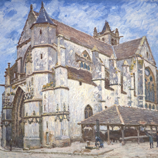
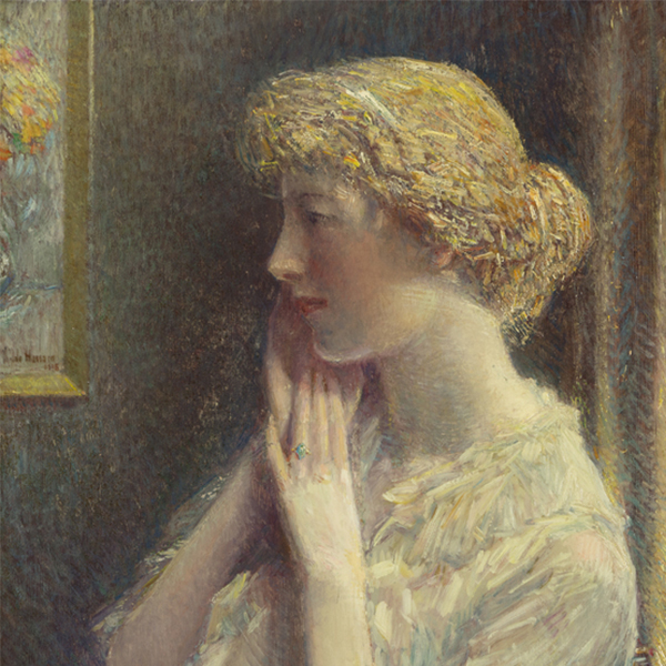
KUNSTWERKE ZUR ANSICHT

CLAUDE MONET

CLAUDE MONET

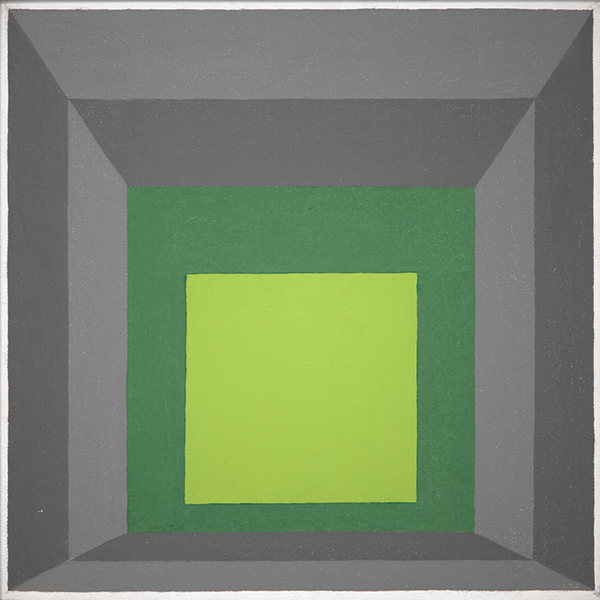
WILLEM DE KOONING

WAYNE THIEBAUD

CHILDE HASSAM

CLAUDE MONET
_tn48131.jpg "PIERRE BONNARD-La robe de chambre rouge (Marthe Bonnard)")
PIERRE BONNARD

CAMILLE PISSARRO

ALBERT BIERSTADT

ALFRED SISLEY

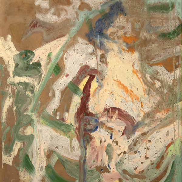
GERHARD RICHTER

GIULIO CESARE PROCACCINI

CHILDE HASSAM

SEAN SCULLY

ALFRED SISLEY

JOHN SINGER SARGENT

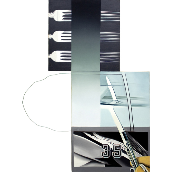
TOM WESSELMANN

TOM WESSELMANN

PIERRE-AUGUSTE RENOIR

WAYNE THIEBAUD

OLGA DE AMARAL

JAMES ROSENQUIST

PAUL SIGNAC

HANS HOFMANN
_tn27843.jpg "ELAINE DE KOONING-Untitled (Totem Pole)")
ELAINE DE KOONING

KENNETH NOLAND

HIROSHI SENJU

GEORGE INNESS

HERB ALPERT
_tn46214.jpg "HARRY BERTOIA-Untitled (Sounding Sculpture)")
HARRY BERTOIA

MEL RAMOS

CAMILLE PISSARRO
_tn48055.jpg "WINSLOW HOMER-Houghton Farms (Girls Strolling in an Orchard)")
WINSLOW HOMER

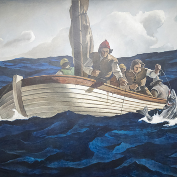
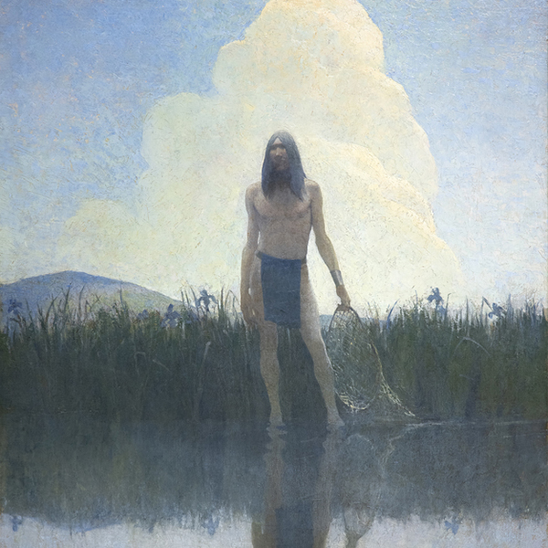
N.C. WYETH

N.C. WYETH
_tn47245.jpg "DAVID TENIERS THE YOUNGER-The Kermesse of Saint George (A Village Festival)")
DAVID TENIERS DER JÜNGERE

JOSEPH KLEITSCH

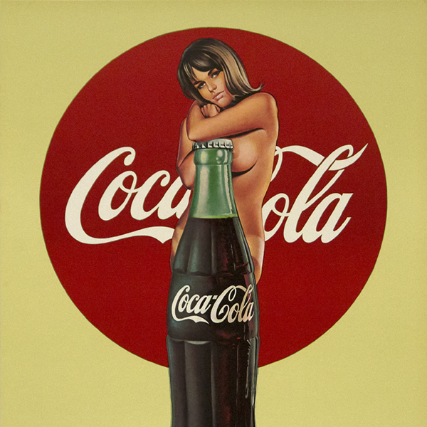
ANDY WARHOL

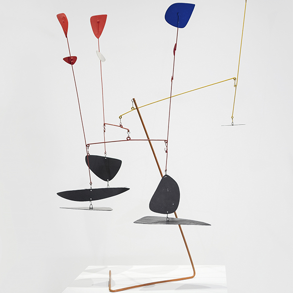
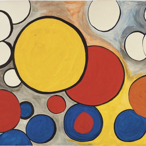
ALEXANDER KALANDER

ANDREW WYETH WYETH

CAMILLE PISSARRO

LEE KRASNER

WILLIAM MERRITT CHASE

Charles Joseph Frederic Soulacroix

MAURICE DE VLAMINCK
_tn48062.jpg "FRANK WESTON BENSON-Girl in White (Seated Figure)")
FRANK WESTON BENSON

MANUEL NERI

MARIA BLANCHARD

MARIA BLANCHARD

CHINESISCH

WALEAD BESHTY

MAURICE DE VLAMINCK

JANE PETERSON

DAVID TENIERS DER JÜNGERE

PIET MONDRIAN

WILLIAM MERRITT CHASE

ALFRED THOMPSON BRICHER

ALSON CLARK

LEON AUGUSTIN LHERMITTE

WILLIAM WENDT

M. Evelyn McCormick

WILLIAM WENDT

MAURICE DE VLAMINCK

JANE PETERSON

JOHANNES MARIN

KARL BENJAMIN

EDGAR ALWIN PAYNE
_tn16764.b.jpg "HARRY BERTOIA-Untitled (Suspended Willow)")
HARRY BERTOIA
_tn40803.jpg "JOANNA POUSETTE-DART-Untitled (Red Desert Study)")
JOANNA POUSETTE-DART

Jules Chéret

N.C. WYETH

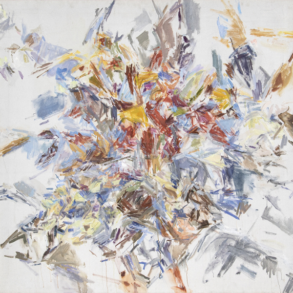
ROBERT NATKIN

LÉON AUGUSTIN LHERMITTE

HASSEL SMITH

TOM WESSELMANN

JEAN-FRANÇOIS RAFFAELLI

TOM WESSELMANN

RUEHL FREDERICK HECKMAN

JEAN BERAUD

EDGAR ALWIN PAYNE

ALFRED STEVENS

AI WEIWEIWEI

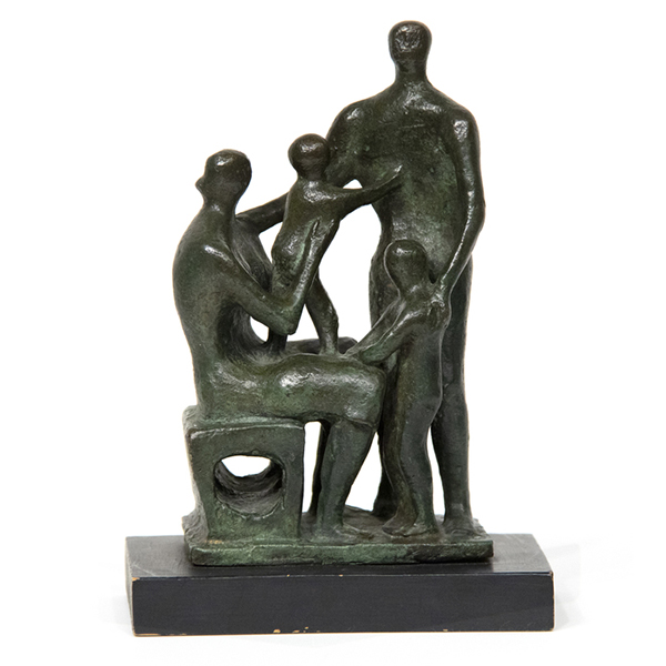
FELIPE CASTANEDA

JEAN MANNHEIM

James McDougal Hart

PAUL GRIMM
CONSULTANTS

MONTANA ALEXANDER
Vorsitzender, Global Director
Palm Desert, Kalifornien
Montana Alexander ist eine angesehene Führungspersönlichkeit in der internationalen Kunstwelt und fungiert als Chairman und Global Director von Heather James. Von der Hauptgalerie in Palm Desert, Kalifornien, aus beaufsichtigt Montana die gesamte Geschäftstätigkeit des Unternehmens und treibt dessen globale Vision voran. Ihr Umzug von New York City zurück nach Palm Desert im Jahr 2025 ist ein bewusster Schritt, um die Verbindungen innerhalb der blühenden Wüstenkunstszene zu vertiefen und den Einfluss von Heather James an der Westküste weiter zu erhöhen.
Seit sie 2013 zu Heather James kam, war Montana maßgeblich daran beteiligt, die Reichweite der Galerie auf den globalen Sekundärkunstmarkt auszudehnen, die unternehmensweite Strategie zu gestalten und die Beziehungen zu einer Elite von Sammlern zu pflegen - von bedeutenden Mitgliedern der ArtNews 200 bis hin zu aufstrebenden Kunstmäzenen. Ihr scharfsinniges Auge und ihre Leidenschaft für Spitzenleistungen haben zu bedeutenden Ankäufen von Werken berühmter Künstler wie Louise Bourgeois, Andy Warhol, Ed Ruscha, Claude Monet und Mark Bradford geführt.
Montanas Führung war ausschlaggebend für den bahnbrechenden Erwerb der Nachkriegs- und zeitgenössischen Kunstsammlung der General Electric Company Corporate Art Collection - eine der bedeutendsten Unternehmenssammlungen, die auf den Sekundärmarkt kamen. Sie stand auch hinter von der Kritik gefeierten Ausstellungen wie "The Female Gaze" (Der weibliche Blick), in der Surrealistinnen wie Frida Kahlo und Leonora Carrington vorgestellt wurden, und "The Paintings of Sir Winston Churchill" (Die Gemälde von Sir Winston Churchill), einer Wanderausstellung, die in Zusammenarbeit mit Churchills Familienbesitz entwickelt wurde.
Mit einem Bachelor of Arts in Kunstgeschichte und Business Management von der University of Connecticut und einem Postgraduierten-Zertifikat in Art Business vom Sotheby's Institute in New York verbindet Montana akademische Strenge mit praktischem Fachwissen. Ihre visionäre Führung macht Heather James weiterhin zu einer dominanten Kraft auf der globalen Kunstbühne, während ihr kürzlicher Umzug nach Palm Desert ein kühnes neues Kapitel für das Wachstum und den Einfluss der Galerie einläutet.

ERIC ARTECHE
Kunstberater
Palm Desert, Kalifornien
Eric Arteche ist Kunstberater bei Heather James Fine Art in Palm Desert, Kalifornien, und verfügt über mehr als 10 Jahre Vertriebserfahrung in der Zusammenarbeit mit Top-Kunden und Fortune-500-Unternehmen. Erics Hintergrund umfasst einen Bachelor of Arts in Sozialwissenschaften und Geschichte vom Westmont College und einen Master of Science in Resilient and Sustainable Communities vom Green Mountain College. Sein ständiger Wunsch zu lernen und sich weiterzuentwickeln führte Eric in die Kunstwelt, wo er zunächst im Bereich Forschung und Betrieb tätig war und nun direkt mit Kunden zusammenarbeitet, um die perfekten Stücke für deren Sammlungen zu finden. Außerhalb der Galerie verbringt Eric gerne Zeit mit seiner Familie, erkundet neue Restaurants, macht Autoreisen und röstet seinen eigenen Kaffee.
IN DEN NACHRICHTEN
NACHRICHTEN

Kürzlich verkaufte Spitzenwerke
NACHRICHTEN

Gibson, Dunn & Crutcher Einrichtungen
NACHRICHTEN

Verkaufen Sie Ihre Blue Chip Werke mit Heather James
NACHRICHTEN

Heather James Museum für Bildende Kunst Leihgaben
NACHRICHTEN

Claude Monet Kürzlich verkaufte Werke
NACHRICHTEN

Der Kunstmarkt März 2023
NACHRICHTEN

Van Gogh-Leihgaben an das Detroit Institute of Arts
PRESSE
Van Gogh als Leihgabe von Heather James bei "Van Gogh in Amerika" zieht Publikum an
PRESSE
Heather James leiht großen Van Gogh an "Van Gogh in Amerika" aus
NACHRICHTEN

Widerstandsfähigkeit des Kunstmarktes
NACHRICHTEN

Kunst als Investition
NACHRICHTEN

Luxuriöse Hausinstallation
VIDEO

Mai 2022 Kunstauktion Saisonrückblick mit Jim Carona
PRESSE

Kurator Chip Tom hilft im Inneren des Musterhauses der Wüstenoase
PRESSE

Iconic Life stellt das von der HJFA kuratierte Desert Oasis Show House vor
PRESSE
Chip Tom Gastrichter
VIDEO

Kennenlernen von Heather James Fine Art
NACHRICHTEN

Wir feiern 25 Jahre Heather James Fine Art
NACHRICHTEN

Heather James eröffnet Beratungsbüro in London
KATALOGE

Revolutionen in der modernen Kunst
KATALOGE

Heather James Fine Art - Über uns
VIDEO

Hassel-Smith-Eröffnungsempfang
DIENSTLEISTUNGEN
Heather James Fine Art bietet eine breite Palette von kundenorientierten Dienstleistungen, die auf Ihre spezifischen Bedürfnisse zugeschnitten sind. Unser Operations-Team besteht aus professionellen Kunsthändlern, einer kompletten Registrierungsabteilung und einem Logistikteam mit umfangreicher Erfahrung im Bereich Kunsttransport, Installation und Sammlungsmanagement. Mit einem weißen Handschuhservice und einer persönlichen Betreuung geht unser Team noch einen Schritt weiter, um unseren Kunden außergewöhnliche Kunstleistungen zu bieten.


KENNENLERNEN
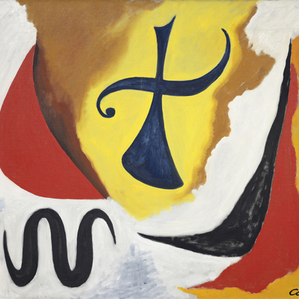
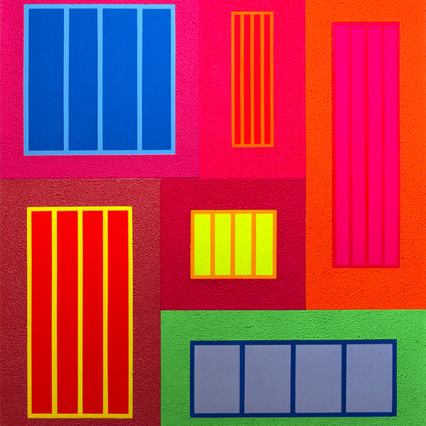
FEATURED ART
,_new_mexico_tn40147.jpg "GEORGIA O'KEEFFE-Cottonwood Tree (Near Abiquiu), New Mexico")
GEORGIA O'KEEFFE
_tn37743.jpg "JOAN MIRO-Tête de femme (déesse)")
JOAN MIRO

ALFRED SISLEY
WILLEM DE KOONING
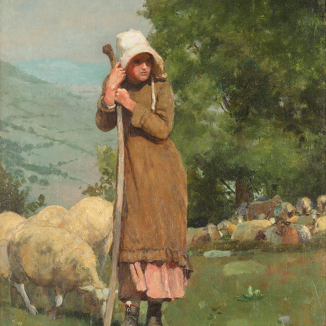
_tn43950.jpg "WINSLOW HOMER-In the Wheatfield (Girl Standing in a Wheat Field)")
WINSLOW HOMER
WAYNE THIEBAUD
GERHARD RICHTER
SEAN SCULLY
TOM WESSELMANN

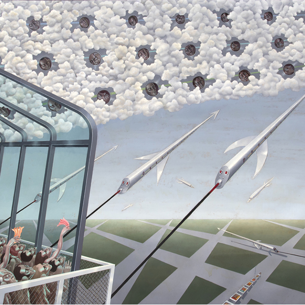
IRVING NORMAN
TOM WESSELMANN
KONTAKT